
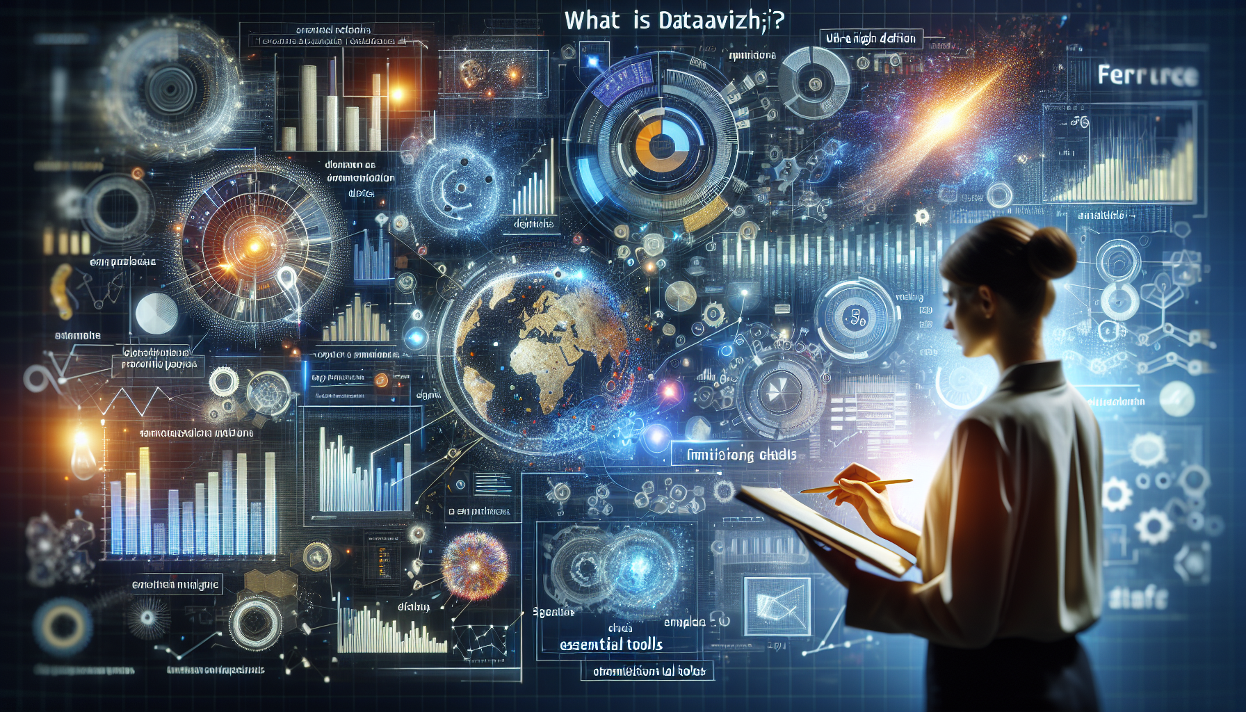
Understanding Dataviz: data visualization
Today, with the immense amount of data generated every second, it becomes essential to know how to present this information in a clear and effective manner. This is where the data visualization, Or dataviz, a disciplinary field that combines design, narrative and statistical analysis to transform complex data into intuitive visual representations.
The objectives of Dataviz
The main ambition of dataviz is to make data accessible to everyone, regardless of the individual’s analytical skills. It aims to:
- Clarify complex data
- Identify new trends and patterns
- Boost engagement with target audiences
- Facilitate decision-making through better understanding
Types of visualizations
There are various methods for representing data, each suitable for different types of information:
- Graphics : They are perfect for showing changes and trends over time.
- Diagrams : Ideal for describing processes or information flows.
- Cards : They highlight geographical disparities or the distribution of phenomena.
- Infographics : Combination of visuals and texts to explain a topic or story.
- Dashboards : They aggregate multiple visualizations for an overview on a given subject.
The importance of design in Dataviz
Good design is crucial in data viz because it influences not only the aesthetics, but also the effectiveness with which information is transmitted. Some fundamentals to consider:
- Clarity : Simplicity helps convey the message more directly.
- Data integrity : Care must be taken to ensure that the visualization accurately reflects the data.
- The colour : Used wisely, it can help to distinguish or emphasize certain data.
- The typography : The choice of fonts and their size can influence readability and interpretation.
Dataviz tools
Several tools can be used to create data visualizations, such as:
- Painting : Powerful for creating interactive visualizations.
- Excel/Google Sheets : Good for basic visualizations such as bar charts or lines.
- Power BI : A tool from Microsoft for more advanced visualizations and analysis.
- D3.js : A JavaScript library for developers who want to create custom charts.
The advantages of Dataviz

Facilitating understanding of data
One of the greatest assets of the dataviz is its ability to simplify the understanding of complex data. Visualizations turn numbers and statistics into charts, maps or infographics, making information instantly more understandable. This simplification allows decision-makers to quickly grasp the essence of the data presented and facilitates informed decision-making.
Improved communication of information
With the dataviz, it becomes easier to share insights with stakeholders, whether or not they have expertise in data analysis. Visualizations serve as a common language allowing all participants to discuss on the same basis of understanding. This strengthens collaboration and alignment within teams.
Rapid detection of trends and anomalies
Graphs and tables allow you to spot trends, patterns, and anomalies at a glance that might have been missed during purely numerical analysis. This can lead to unexpected discoveries, improving the responsiveness and adaptability of organizations in the face of sudden changes or opportunities.
Data-Driven Decision Making
By making data accessible and easily interpretable, dataviz supports a culture of fact-based decision-making. This can help reduce personal bias and decision-making based on unfounded intuition, leading to more robust and verifiable business strategies.
Saving time and effort
Data analysis can be a long and tedious process, but through the effective use of dataviz, users save time and effort. Visualizations allow analysts and stakeholders to grasp the implications of data without having to delve into complex details. This frees up time for higher value-added tasks, such as strategy and innovation.
Improved data accessibility
There dataviz makes data analysis more accessible to a wider audience. By reducing technical barriers, it allows professionals from all backgrounds to participate in data-driven discussions and make their unique contribution to problem solving. This democratizes access to information and promotes a knowledge-based society.
Essential tools and software in Dataviz

Whether you’re an analyst, data scientist, or communicator, using Dataviz tools can reveal the trends and stories hidden behind raw data. Here is an overview of the essential tools and software in this area.
Painting
Painting is arguably one of the most popular data visualization software in the professional world. It offers a wide variety of charts and high interactivity for users, allowing them to create sophisticated dashboards. In addition to its ability to manage large volumes of data, Painting stands out for its ease of use and integration with a multitude of data sources.
Power BI
Microsoft Power BI is a business intelligence tool that makes it easy and quick to visualize data and share insights across an organization or integrate them into an application or website. Power BI connects to a wide range of data sources, is known for its ease of integration with other Microsoft products like Excel and Azure.
QlikView and Qlik Sense
Qlik offers two major products: QlikView And Qlik Sense. QlikView is more focused on customizable dashboards and reporting, while Qlik Sense stands out for its data discovery capabilities and user-friendliness. They are both heavily geared toward in-memory analytics, providing fast processing for interactive data visualization.
Google Data Studio
Google Data Studio offers good integration with other Google services such as Google Analytics, Google Sheets and AdWords, making online sharing and collaboration incredibly easy and efficient. It is an ideal tool for those who are new to Dataviz, because it is free and relatively easy to use.
D3.js
For those with web development skills, D3.js is a JavaScript library for manipulating data-driven documents. D3 is extremely flexible, allowing the creation of dynamic and interactive data-driven graphics and visualizations, directly in the web browser.
Other relevant Dataviz tools
Alongside these Dataviz giants, there are other remarkable tools such as GraphPad Prism, Origin, And SigmaPlot for more specialized science and engineering needs. R and its multitude of graphics packages, ggplot2 being among the best known, is also very popular with statisticians and researchers.
The Dataviz universe is vast and constantly evolving, offering a range of tools adapted to each professional need. Whether for presenting results to non-technical partners or for exploring complex data in a research context, Dataviz tools have become essential in the processing and communication of quantitative information.
Leave a Reply